What’s the most important aspect of your website?
Ask 100 people this question and you’ll receive 100 different answers.
And while there is no right answer, there can be clues that help point you in the direction of making changes to benefit your business.
For instance, when was the last time you updated your site? If its been more than a couple of years, its time for a change. Technology changes at the blink of an eye. Even though your “old” site may look good and function okay, it probably doesn’t offer the latest features that can truly help you market your business.
Take for instance the recent switch to mobile technology.
In 2010, around 7% of our global population had smart phones. Today that number has increased to 1 in 5. And tablets are growing at an even higher rate, meaning smart technology will be in the hands of just about everyone within a very short period of time – months, not years. Amazing, right?
If your site was developed three years ago to look good on a desktop computer, how does it function now that more people are accessing the web via their phones and tablets than ever before?
In some cases, your site may work. In some cases, it may not show up at all. (Yes, if you have a site with Flash technology, it doesn’t show up at all on a great majority of the smart technology in use today.) Yet however it works, the most important question you should be asking yourself is where will you go from here?
Ask yourself two questions.
Who is my target client?
What am I doing to reach them?
Start with your target client. Who are they? What do they do? How do they search for information? Do they use smart phones and tablets on a daily basis?
If the answer is yes, and more than likely it is, are you keeping up with the technology needed to reach them and motivate them in a way they will see what you have to offer?
What makes a site mobile ready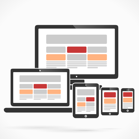
Sites built with old technology were built to conform to a certain screen size. A designer knew that the standard monitor screen size is 1024×760 pixels, so they would conform their design space to match that size requirement, knowing their design would be visible and complete to the majority of the people that viewed it online.
That was fine when the entire population used a desktop or laptop computer to access the Internet.
Enter smart technology.
And the design space became more difficult.
People no longer view the online world from one standard device. Smart phones range from large to small. Tablets come in many different sizes and shapes. Even desktops and laptops add into the confusion by keeping their standardized format.
What looks good on a 19 inch computer monitor won’t look the same on your iPhone 5. And that’s where the trouble begins.
A mobile ready site takes all of that into account.
A mobile ready site design uses what is called responsive design, meaning that the design isn’t based on a standardized measurement, but is instead designed in such a way that it will move and be fluid depending on how it is viewed.
Our site, TheSocialGhost.com is built using responsive technology. So if you view it on a desktop monitor, you will see one portion of our home page like this:

But if you view the same section on an iPhone, you’ll see it like this:

It moves and changes to give the best representation in the format you are viewing it with.
The important thing is the content. If you can’t see it, you won’t use it. And you’ll search until you find a company that offers you the information you are looking for in a way you can view it.
And if you’re not there, you can’t expect the business.
So the ultimate question to you is
How much business do you want from the online world?
If you are ready to grow and reach out to today’s clientele, it’s more important than ever to be there in a format that is convenient for them. If not, you’re missing out on opportunity.